Strategy
10 Insurance Agent Landing Pages to Copy and Test in One Week
By Nick Georgalos · 13 min read · Updated 2026-08-30
10 Insurance Agent Landing Pages to Copy and Test in One Week ! Hands assembling landing page mockups A high-converting insurance agent landing page turns paid traffic into qualified leads by isolating one product and one audience per page, then guiding that specific visitor to a specific action.

A high-converting insurance agent landing page turns paid traffic into qualified leads by isolating one product and one audience per page, then guiding that specific visitor to a specific action. The single best first step: stop sending clicks to your homepage or a multi-product site, and build one stripped-down page for, say, final expense buyers aged 60 to 75. Unbounce’s insurance landing page examples show this pattern repeatedly, and Statista’s trust-factor research confirms visible credibility signals close the gap that generic pages leave open.
TL;DR:
- Using a clear headline that states the target audience and outcome significantly increases visitor engagement over generic product names.
- Progressive disclosure, starting with one low-stakes question before revealing the full form, boosts mobile form completion rates.
- Placing trust signals like license numbers, carrier logos, and testimonials near the CTA improves credibility and reduces hesitation.
- Cutting navigation and loading pages in under three seconds on mobile elevates conversion chances; load speed is critical.
- Testing different license number placements and simplifying forms can further lift lead submissions by addressing visitor doubts directly.
Table of Contents
- Core Elements Every Insurance Agent Landing Page Needs
- Landing Page Examples: What to Copy From Each
- How to Test and Measure Insurance Landing Page Performance
- How FexAds Builds and Runs Insurance Landing Pages
- What I’d Change This Week to Lift Conversions
- FexAds Offer: When to Hire Us vs. DIY Resources
- Handy Resources for Building Your Next Page
- Sources
Core Elements Every Insurance Agent Landing Page Needs
Most agents lose leads before the visitor ever sees a form, because the page above the fold fails to answer “is this for me?” fast enough. Get these seven elements right and you fix that problem at the source.
Headline that names the audience and the outcome, not the product. “Affordable Final Expense Coverage for Seniors 60 to 85” beats “Life Insurance Quotes” because it tells the visitor, in three seconds, that they’re in the right place. A headline built around the product name alone forces the visitor to do the matching work themselves, and most won’t bother.
A subhead that carries a real benefit or price anchor. If you can legally state a starting monthly premium range or a coverage amount (“Coverage from $10,000, no medical exam required for many applicants”), use it. Vague subheads like “Get the coverage you deserve” add nothing a skeptical visitor can act on.
A single primary CTA, paired with progressive disclosure. Instead of dropping a ten-field form on page load, open with one low-stakes question, like “What state do you need coverage in?” Only after that micro-commitment do you reveal the short form asking for name, phone, and date of birth. This pattern, sometimes called progressive capture, tends to raise completion rates on mobile traffic because each screen asks for less.
Form field order matters more than field count. Ask for the easy, non-threatening fields first (state, age range, coverage type) and save phone number and email for the final step, once the visitor has already invested a few taps. Mark only the fields you truly need as required; everything else should be optional or removed entirely.
Trust builders placed near the CTA, not buried in a footer. Licensed-agent badges, your NPN or state license number, carrier logos you’re appointed with, and one or two short testimonials all reduce the hesitation that kills form submissions. Statista’s consumer trust survey found that a significant portion of consumers say clear business trust signals directly increase how much they trust a company, which is a meaningful lift for a page competing against dozens of insurance ads in the same feed.

Mobile speed and structure. Most insurance ad traffic arrives on a phone. Strip navigation menus entirely, since a page with no exit links keeps the visitor focused on one decision. Target a load time under three seconds, use compressed hero images, and avoid heavy carousels or embedded video that stalls the render.
A one-sentence privacy promise, plus visible licensing. Something as short as “We never sell your information, and you’ll only hear from a licensed agent” placed just above or below the form removes a specific objection. State your license number and the states you’re authorized to write in near the footer or trust section, not hidden on a separate page.
- Name the audience and outcome in the headline, never just the product
- Use progressive disclosure: one question, then a short form
- Order form fields from low-friction to high-friction
- Place license numbers, carrier logos, and testimonials near the CTA
- Cut navigation entirely and compress for sub-three-second mobile load
- State your no-spam promise in one sentence, close to the form
Pro Tip: Test your license number placement two ways: once directly under the headline, once in a small trust bar just above the form. Agents often see a measurable lift when licensing sits closer to the CTA, because it answers the “is this legitimate?” question at the exact moment of hesitation.
Landing Page Examples: What to Copy From Each
Real patterns beat theory. Here are ten landing-page approaches worth studying, broken down by audience, headline logic, CTA structure, and the one trust element doing the heaviest lifting. Instead of naming specific brands, treat each as a template you can rebuild in an afternoon.
-
Instant quote page for final expense, 60+ audience. Headline leads with age range and price floor: “Final Expense Coverage From $9,900 Coverage, No Exam for Many Applicants.” CTA button reads “See My Rate,” not “Submit.” Trust element: a state license number displayed directly beside the CTA. Steal this: pair a concrete number in the headline with a low-commitment CTA verb.
-
Education-to-appointment page for IUL prospects. Rather than asking for contact info immediately, the page walks through three short paragraphs explaining how indexed universal life builds cash value, then offers “Book a 15-Minute Call” instead of a form. This matches Mailchimp’s guidance that complex products convert better with a nurture-first approach than an immediate hard sell. Steal this: for products that require explanation, replace the form with a scheduling link.
-
Medicare Advantage enrollment-window page. Headline anchors on urgency tied to a real calendar event: “Compare Medicare Advantage Plans Before the October 15 Deadline.” The form’s first question is zip code, since plan availability varies by county. Steal this: use a real, verifiable deadline rather than manufactured scarcity.
-
Mortgage protection page targeting new homeowners. Hero image shows a house, not a family, which keeps the visual literal and avoids stock-photo fatigue. CTA button copy: “Protect My Mortgage Payment.” Steal this: match the visual to the specific financial event, not a generic lifestyle scene.
-
Progressive-capture final expense page with a one-question warmup. The first screen asks only “What state do you live in?” with large tap targets. Once answered, the page reveals a four-field form. This mirrors the low-friction pattern in Perspective’s landing page collection, which highlights initial-question flows as a way to commit visitors before asking for contact details. Steal this: build your form as two screens instead of one long scroll.
-
Referral-driven agent bio page. Instead of a generic sales pitch, the page opens with the agent’s photo, license number, and years serving a specific region. One agent site, Ask For Lenny, leans on this exact pattern: local service framing paired with a visible no-spam promise and license credentials right on the homepage. Steal this: local specificity plus a licensing badge beats a polished but placeless design.
-
Comparison-anchored personal lines page. Headline poses a direct comparison: “See How Much You Could Save Switching From Your Current Auto Policy.” Form asks for current premium range as the first field, which both qualifies the lead and increases perceived relevance. Steal this: ask a qualifying question that also flatters the visitor’s effort to compare.
-
Video-testimonial final expense page. A 30-second client testimonial plays automatically muted with captions, positioned directly above the form. Perspective’s example breakdowns note that pages disclosing their conversion rates alongside a “why it converts” explanation often point to social proof placement as the deciding factor. Steal this: captioned, muted-by-default video outperforms silent testimonial text blocks on mobile.
-
Bundle page for agents cross-selling final expense and IUL. Rather than one CTA, the page offers two distinct buttons: “I Need Final Expense Coverage” and “I Want to Build Cash Value,” each routing to a separate short form. Steal this: when one ad campaign serves two audiences, split the CTA rather than forcing everyone through one funnel.
-
Single-purpose, no-navigation instant-quote page. No header menu, no footer links except the privacy line and license number, one form, one CTA. Instapage’s guidance on insurance landing pages points to this exact removal of navigation as a consistent lift factor because it eliminates every alternative path off the page. Steal this: delete every link that isn’t the form or the phone number.
Across all ten, the pattern that separates instant-quote pages from education-first pages is buyer intent. Final expense and auto shoppers often already know what they want, so a fast form works. IUL and Medicare shoppers usually need context before they’ll hand over contact information, so a scheduling CTA or short explainer outperforms a bare form.
How to Test and Measure Insurance Landing Page Performance
Lead count alone tells you almost nothing about whether a page is actually working. An agency playbook on funnel measurement points out that quote starts, appointment rate, and bind rate matter more than raw lead volume, because a page can generate cheap leads that never convert to a written policy. Prose Media’s insurance marketing playbook recommends tracking the full funnel from quote start through issued policy, not just the top of it.
Run your testing in this order with AI-powered tools like Signal Engine’s marketing automation to optimize each step:
- Headline test first. Swap the audience/outcome framing against a plain product name headline, and run both against the same traffic source for at least one to two weeks.
- First-question flow versus full form. Test the progressive-disclosure pattern against a single long form on identical traffic to see which produces more completed submissions per visitor.
- CTA wording and color. “See My Rate” versus “Get a Free Quote” often produces different click-through rates even when the destination form is identical.
- Hero proof versus inline proof. Test license badges and testimonials placed above the fold against the same elements placed just below the form.
Stop a test once you have roughly 100 conversions per variant, or two to three weeks of consistent traffic, whichever comes first; smaller sample sizes make it easy to mistake noise for a real winner. On tracking, use a consistent UTM naming convention across every ad set so you can trace a lead back to the exact headline and audience combination that produced it, and route form submissions directly into your CRM rather than checking a spreadsheet manually.
Speed-to-lead is the metric agents underrate most. A 15-minute follow-up SLA on new form submissions consistently outperforms same-day callbacks, because interest decays fast once someone leaves the page.
How FexAds Builds and Runs Insurance Landing Pages
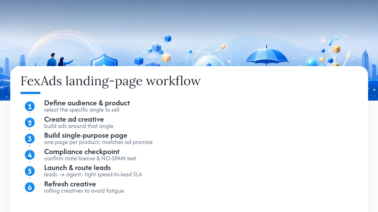
The workflow we run for agents follows a fixed sequence: define the audience and product first, build the ad creative around that specific angle, then build a single-purpose landing page that matches the ad’s promise exactly. No page serves two products. After launch, every lead routes to the agent under a tight speed-to-lead SLA, and creative gets refreshed on a rolling basis to avoid fatigue.
The core difference in this model is ownership. Leads generate directly inside the agent’s own ad account, which means the agent owns the data, the audience insights, and the retargeting pools that build up over months of running campaigns. That’s a structural difference from buying rented leads shared across multiple agents, where none of that historical data belongs to you.
Pro Tip: If you’re building your own progressive-capture form, add a compliance checkpoint before launch: confirm your state license number and NO-SPAM language appear on every version of the page, including any duplicate you create for A/B testing. It’s an easy field to forget when you clone a page fast.
What I’d Change This Week to Lift Conversions
If I had one agent’s landing pages in front of me right now, here’s the 72-hour plan. First, pick exactly one product and one audience segment, then build a stripped-down page with nothing else on it. No cross-sell, no secondary CTA, no navigation.
Second, split your traffic and test a one-question lead flow against your current full-form page, using the same ad set so the comparison is fair. Most agents assume a shorter form always wins, but on higher-intent traffic a slightly longer form sometimes filters out weak leads that were never going to answer the phone anyway. Test it instead of assuming it.
Third, set a 15-minute speed-to-lead SLA and actually test your routing logic, not just your intention to call fast. Submit a test lead yourself at 9 p.m. on a Saturday and see what actually happens. If nothing happens, that’s the gap costing you the most money.
— Nick
FexAds Offer: When to Hire Us vs. DIY Resources
If you’ve got the time and the design skills, you can build every pattern above yourself. If you’d rather have exclusive leads landing in your own ad account within days instead of weeks, that’s the gap FexAds fills. We build the single-purpose landing page, set up the ad account and pixel, target the audience, and hand you leads that belong to you, not leads shared with three other agents in your area.
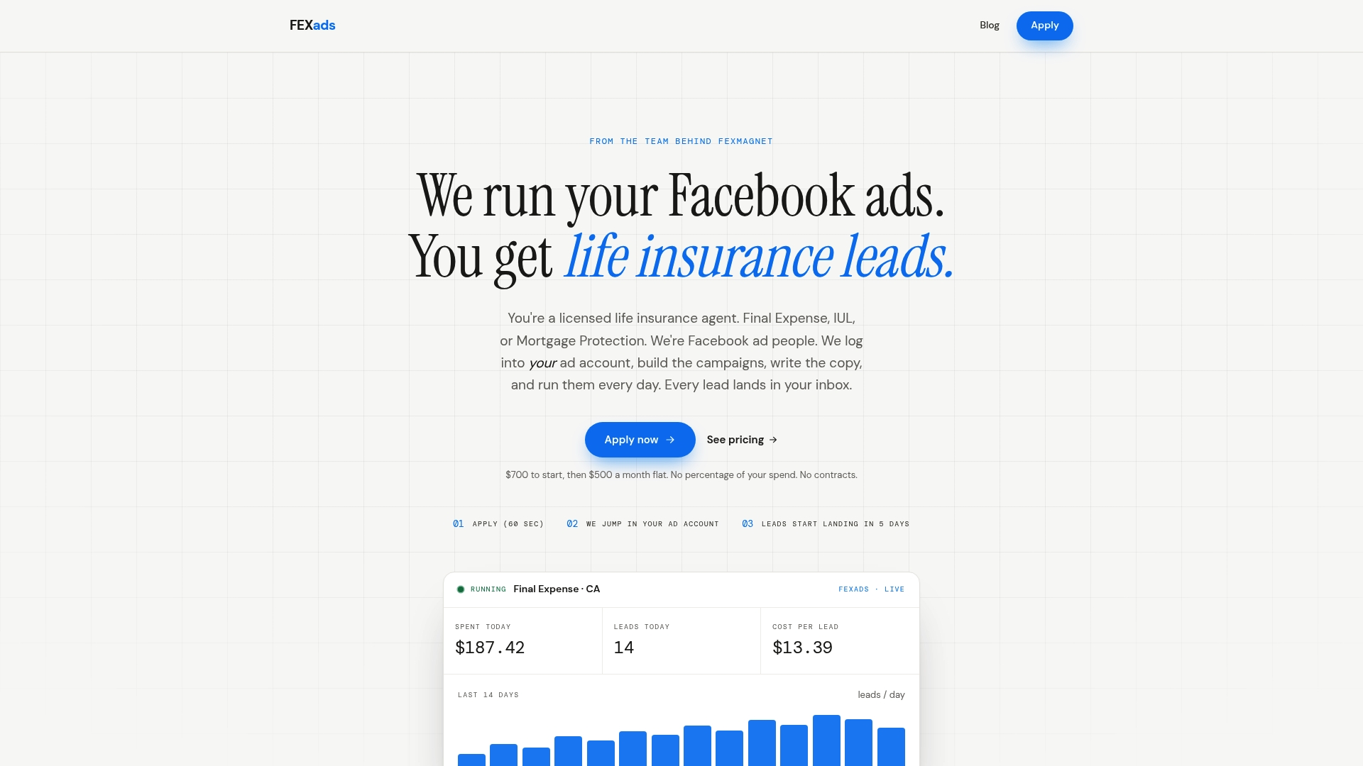
Every campaign we run generates leads directly inside your ad account, so the data, the audience history, and the retargeting pools stay yours even after months of optimization. If you want a sense of what campaigns look like in your specific market, check our state-by-state final expense programs, or run your numbers through the CPL calculator to see what a realistic cost per lead looks like for your product line before you commit a budget. Apply through the FexAds homepage to start the setup process.
Handy Resources for Building Your Next Page
- Unbounce’s insurance landing page examples for annotated design patterns you can copy directly.
- Instapage’s insurance landing page guidance for single-purpose page structure and navigation removal.
- Mailchimp’s insurance marketing resources for nurture-first flows on complex products.
- OJay Media’s 2026 insurance agent marketing playbook for narrow-campaign targeting strategy.
- FexAds’s own lead form ad glossary entry and final expense vs. landing page comparison for deeper tactical detail.
This article is general information, not a substitute for advice from a qualified financial advisor. Consult a qualified financial professional about your own circumstances before acting on anything here.
Sources
- Statista — factors that help consumers trust a business (US)
- Unbounce — 10 insurance landing page examples to generate quality leads
- Mailchimp — insurance marketing guidance (education and nurture)
Recommended
Want us to run your FE ads?
$200 to launch, custom website included. $500 a month flat, starting at your first sale.
Apply now